
Korean Senior Community Center Los Angeles
Web & Mobile Redesign
Introduction
KSCCLA
Korean Senior Community Center Los Angeles is an organization that provides for elderly citizens all over Southern California community by hosting in-person classes. OMC: Family Chapel volunteered to help KSCCLA launch a new program in hopes of improving the lives of senior citizens impacted by COVID.
UX Team: Haejin Suh, Isaac Kim, Sunny Lee, Sam Lee
Collaborators: Production & Translation team
Timeline: 12 weeks
Role: Lead team of 3 UX researchers & designers, Research, Wireframing, Prototyping, Quality Check
Tools: Adobe Illustrator, CSS, Squarespace, Adobe Lightroom
Problem Space
Problem Statement
Due to COVID, all of KSCCLA’s classes have been cancelled, leaving many of our elderly citizens isolated. The current website is outdated, unorganized, and does not have the ability to host online classes.
Goals
KSCCLA requested OMC Family Chapel to redesign the current website to:
Redesign current website with an easy to navigate online learning experience
Improve overall web navigation & visuals
Help elders feel connected through learning
RESEARCH
Heuristic Evaluation
As soon as we took on this project, our team started a brainstorm session to evaluate the main pages of the existing website:


Pre-Research
With a specific age range of our target demographics, we researched topics on UI/UX(User Interface & User Experience) for older audiences.
Toptal - Age Before Beauty – A Guide to Interface Design for Older Adults
Usability Geek - UX Design Thinking From A Senior Citizen’s Perspective
Medium - What designing for seniors has taught me
Key Insights
Visually contrasting UI
Clear UX Writing (remove slangs or jargons)
Easy and short sitemap
Everyone loves a beautiful product - do not underestimate users
Website Analytics
To create an appropriate strategy for the redesign, I analyzed the existing website’s analytics provided by IONOS (current website provider):
“Contact Us” is the second most frequently visited page; therefore, the page should be easily accessed (currently a subpage under “About us”)
Many users’ last page before leaving the website is “Contact Us.” This reinforces the previous insight on the page’s need for quick access
2 out of 3 most commonly used browsers are mobile
New website redesign should also be catered towards mobile users
Website Builder Comparison
After interviewing main key stakeholders(KSCCLA board members), our team determined some qualities to be used to compare popular different website builder platforms.s
Final Recommendation
Our team collectively decided to recommend Squarespace to KSCCLA for 3 reasons:
Intuitive editor that’s hard to fail
Clean & cohesive visuals
Easy for KSCCLA members to update the website after the hand off
Read more: Recommendation Deck
Ideation
Redesigned Website Qualities
Once our main stakeholders approved Squarespace as our new website builder, we narrowed down 5 key qualities for the new, redesigned website:

Sitemap
Next, we created new sitemap that simplified the existing website emphasizing the 5 key qualities mentioned above. After the stakeholders reviewed our low fidelity prototype shown below, they provided feedback on the new Calendar feature. Based on these changes, we created our final sitemap.
Existing Sitemap:

Final Sitemap:

PROTOTYPING
Low Fidelity Prototype
After confirming our sitemap, I created a low fidelity prototype of the English version.


UX Writing & Translation
To create a meaningful and friendly experience, our team focused on the UX writing portion of the website to create the final prototype.
Once the messaging was approved by the team at KSCCLA, we collaborated with the Korean translation team of the project.


USABILITY TESTING
User Testing
After many rounds of updates and feedback, we put our high fidelity website to the test by observing how easily 7 participants were able to navigate through the 3 given scenarios highlighting 4 features of the website.
Scenario 1 - Contact Us
After hearing about KSCCLA and their mission, you decide to get in contact with the organization. Please:
Find a way to contact the organization
Scenario 2 - Calendar
As a senior member, you want to see upcoming classes for this month to plan out your schedule. Please:
Show me how you would find this information
Find a class to join
Scenario 3 - Classes & Gallery
You are a senior who used to attend KSCCLA in-person class now new to the website. Please:
Show me how you would view the list of available classes
Show me how you would find old images from your 2020 classes
User Feedback

Iterations
From evaluating the data and interview content from the first test and conducting remote testing, these were the resulted changes in the product:
Home Page

Classes


Microinteractions
Low Fidelity

Final Website


Pop Up
To promote the new launch of KSCCLA’s new, online classes, our team added a pop up message


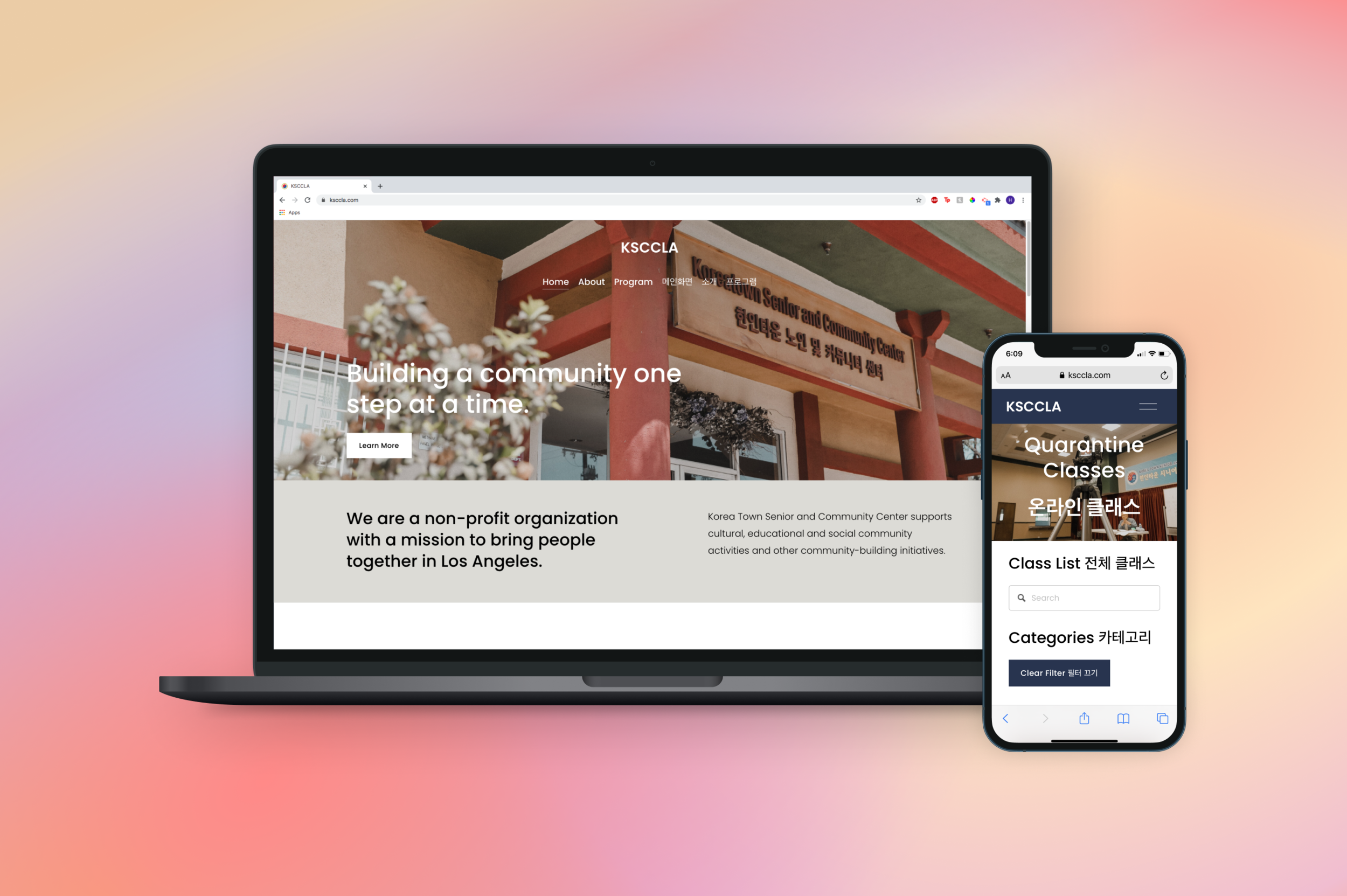
Final WEBSITE
REFLECTION
Results
During the first month of launch:
We saw a 60.5% increase of impressions compared to the highest viewed page from the previous website
Recent publicity of this launch covered by Radio Korea increased traffic for the website
Because the website has launched less than 2 months ago, more accurate data will be collected the following year.
Insight
This 12 week project with KSCCLA allowed me to use my design to connect people in need and strengthened my belief that good design adds so much to the world. It was also such a blessing to lead a team of amazing designers and collaborate with other volunteer teams who are so amazing at their jobs.
Other valuable lessons I learned along the way are:
Setting Expectations
Keeping a clear deadline (not “as soon as possible” “whenever you have time”) was so important in working in a big redesign project like this. Especially because this project is not part of people’s full time job, I worked around not only my personal schedule, but other teammates’ busy life. Rather than giving a deadline that “seems” about right, I always made sure to ask for people’s schedule and readjusted to a date that did NOT delay the project OR stress the team out.
Compromising with Stakeholders
Especially in our first low fidelity feedback, KSCCLA stakeholders requested last minute additions that were not communicated initially. Luckily, we were able to find a place of compromise in certain functionalities and made sure that any future feedback/requests were communicated before creating the final prototype/website.
Next Steps
Our UX team is now preparing for the handoff for KSCCLA to update and run the website. We are creating online tutorials and style guidelines to make this transition smooth and convenient.
Our video team is also working on creating more quarantine classes to sustain traffic and keep our seniors engaged!
We also plan to optimize the search bar by adding more key words that users have been searching online.